.jpg)
As mentioned above, a poor user experience will tend to cause a high bounce rate and leave visitors with a bad taste in their mouths when it comes to your brand or product. Our goal is to create a great experience for those that are using our websites or apps and create a positive lasting impression for our brands or products while leveraging our sites to grow our businesses.
If you are new to the idea of UX design, or just starting out with your own website, you may be thinking to yourself, “How do I create a better web experience for my visitors?”. I’ve created this list of 5 things to consider if you want to improve the user experience for your website or other projects you may be working on.
1. Check for color contrast
Making sure that your visitors are able to easily read and consume the content on your website is vital to creating a good user experience. Following the WCAG guidelines is a great way to ensure that your text is legible against the background and create an experience that is also accessible to many people. See the image below for an example of good versus poor color contrast.

2. Have clear visual hierarchy
By having a clear visual hierarchy, you help guide visitors to important information and areas that you want their focus to be drawn to. There are a variety of ways to create visual hierarchy, including:
- Color contrast (here it is again!)
- Using size to enhance (or reduce) visibility
- Typographic Hierarchy
- Fonts
- Space
This is not a definitive list of ways to create visual hierarchy in your website, but they are a good place to start to understand the fundamentals.
3. Make it easy for visitors to reach you
If you make it difficult for people to find a way to get in contact with you, that will also lead to a poor user experience for your visitors. Industry best practices are to create a variety of pathways for visitors to find avenues to reach you. You’ll frequently find a “Contact Us” link in the main navigation, somewhere in the page’s content, and even in the footer of the webpage.
Creating clear and obvious places for people to connect and get in contact with you through your website is a great way to improve the UX on your site. Forms, buttons to contact pages, and contact links in the footers of the pages are some examples of ways to help visitors easily navigate and find a way to reach you if they need to.
It could also be seen as a deceptive or shady practice if you are purposefully trying to avoid or hide from your users. By making yourself easy to reach, you are also creating a sense of trust with your visitors.
4. Optimize images for quick loading speeds
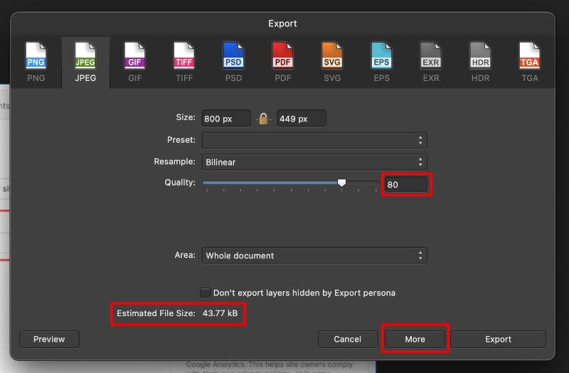
By making sure that the images on your website are properly sized and in the correct formats, you can improve loading speeds for your webpages and in turn, create a better user experience for your visitors. Have you ever gone to a website and it takes forever to load? Following this tip is one way to streamline your loading times and helps optimize your website for a pleasant experience.
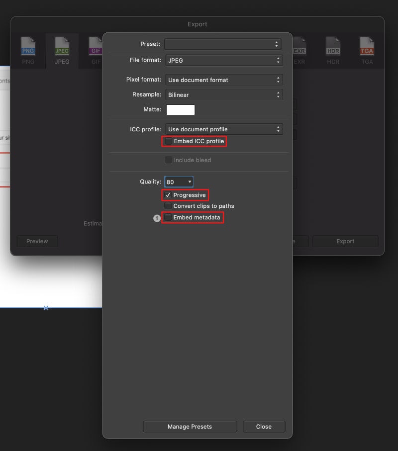
Using photo editing software, you can resize images appropriately and also strip them of unneeded embedded data that helps lighten their file size. Depending on which program you use, you typically are able to export images using these tips and have something that is ready for the web. You can even go a step further and compress the images with a program like TinyPNG.com – I will typically do this additional step to create even smaller file sizes for my projects.


After optimizing your images and lightening the data load of your website, you increase the loading speeds of your pages, but also help to create a more accessible website in the process. Individuals in rural parts of the world where the internet speeds are slow, or those in developing countries, may be viewing your content on mobile phones over a cellular network or other devices on wifi. By lightening the load of your website, you create a good experience for them and at the same time don’t surprise them by using all their phone plan’s data to view your website. It’s a win-win!
5. Make sure it’s responsive
With so many devices being used to view websites and apps these days, it’s best practice to develop something that is responsive and viewable on many different screens. If your website is only designed for desktop and you are viewing it on a mobile device, you would likely get a horizontal scroll bar and have a difficult time navigating the website in this way.
Many website builders that involve templates, such as Squarespace and Shopify, typically take the leg work out of this for you and create templates that are responsive and look fairly good on large and small devices. Webflow makes it very easy to create responsive websites and apps by having some default breakpoints that you can drag through to fluidly see the design adapt.
No matter the platform you use for your website, it’s important to make sure visitors can consume your content easily on any device.


