

.jpg)
When it comes to designing a website for a client, or your own website, you want to make sure that the content you are displaying is accessible to everyone, including those that have disabilities. When websites are properly designed and developed, even those with disabilities can use them; however, there are many sites out there that still have barriers to those with different disabilities.
While the web is becoming more accessible with the hard work of designers and developers taking action and proactively planning projects with accessibility in mind, there are still some out there who may not realize how their decisions are creating poor experiences for different people with potentially overlooked disabilities.
Some of the disabilities that can affect access to the web include:
- visual
- auditory
- speech
- cognitive
- neurological
- physical
Web accessibility also benefits people without disabilities, too. Consider how accessibility creates inclusion for those with temporary disabilities (like a broken arm), or challenges due to aging (with their vision), people in rural areas (with poor/slow internet connection), or others in developing countries. There are many benefits to creating accessible web content for yourself, and for your clients.
Here are the 3 big considerations for web accessibility when it comes to your projects.
1. Make sure the color contrast ratios comply with WCAG guidelines
Ensuring there is sufficient color contrast between text and backgrounds improves the experiences for both those with and without disabilities, especially those who have visual impairments. WCAG guidelines help to create an industry standard for contrast ratios that fall within three levels of scoring:
- AAA (considered high contrast, with a score of 7.0 or higher)
- AA (minimum contrast level, with a score of at least 4.5)
- Fail (not enough contrast between the text and background, a score of 3.0 or less)
Webflow is extremely helpful in that they have built in audits that help you make good accessibility decisions while you create. They have a built-in color contrast analyzer that helps you visually see when you have a passing score and make sure your contrast ratios are good!

2. Include alt text for all your important images
For your website visitors that are severely visually impaired or blind, they need to be able to understand the context of important images related to your site content. Alternate (alt) text is an attribute that allows you to set a text-based description of your images. This gives those using screen readers to hear the important image information and gives an overall better experience to your users. Alt text also is displayed by default if an image fails to load properly.
In Webflow, you have the ability to add alt text to images in quite a few locations, but one of the easiest is in the assets panel. Under the assets panel (keyboard shortcut: “J”), you have access to all of your different images, logos and icons, and this is where you can enter in the alt text all in one place.
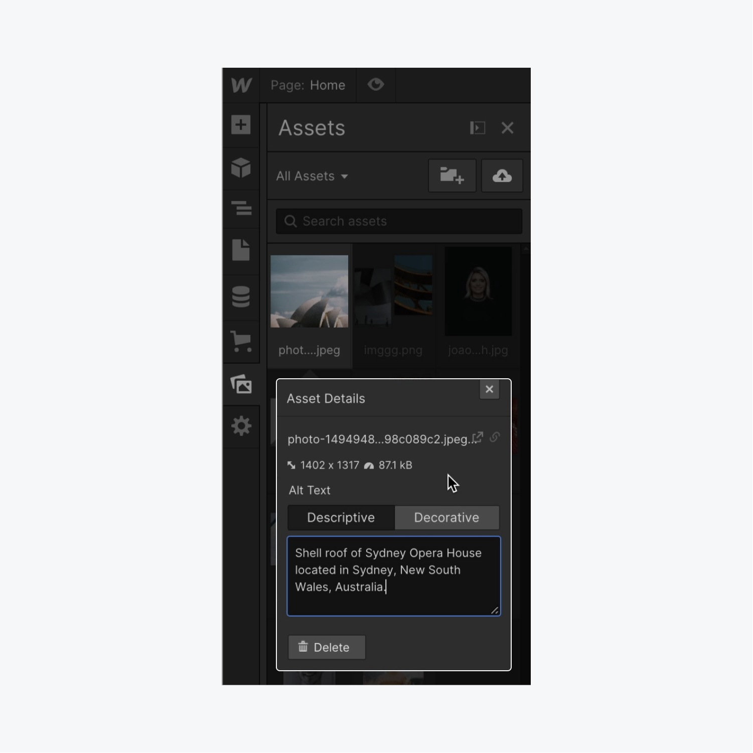
Be sure to include alt text for all your important images, be concise and descriptive in the text, leave out words like “photo” or “image”, avoid repeat text surrounding the image, and to enter a space on decorative images, so that screen readers don’t announce them.
3. Your buttons and links have meaningful names
When screen reader users are getting an overview of all the links on a page, the reader will read the link or button out of context and in a list format. For this reason, it’s important to make sure your buttons and link names are relevant and meaningful to others.
You want to make sure that your buttons or links tell the readers what the link is and where it is taking them. You want to be sure to use clear and specific verbiage that indicates where the link leads to and why the user might want to click it. If it’s a downloadable pdf file or a video, be sure to indicate that with the link context for your visitors.
Things to avoid when it comes to creating accessible buttons or link names are linking raw URLs and creating links with generic terms like “click here” or “more”. Screen reader users will hear the full URL if a raw URL is linked, and without useful context, the reader will not be sure of the function of the link/button. Links with vague context also create problems for those with screen readers, but also for those without disabilities sometimes. Making descriptive link names will help entice users to click, while helping direct people to where they need and want to go. You want to “call them to action” with your CTA!
For more on link and hypertext accessibility, be sure to check out WebAIM’s article on links.


